Altough I'm quite sure that we haven't seen the last of the interface in the different menus, I'd like to comment a couple of details.
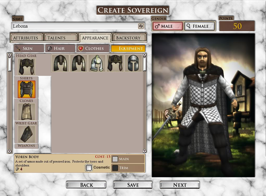
Don't mind the crappy edition (or the marble background, it's a thing for my mod. The background, not the crappy edition).
Many screens would benefit of an approach similar to that of Kingdom Info screen, with options to one side that give access to different options.
The Create Sovereign screen for example, in the equipment section could use some subsections based on the different body slots and according to which we select, we get to pick up from a list of appropiate equipment for that slot. Clothes section could use it, or some of the unit desing ones.
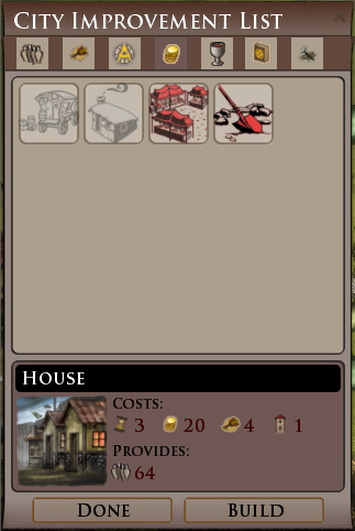
The City Improvement List could use some tabs for the different types of buildlings.
Also, I like the work you are doing with it but I get a feeling of flat... or... well, not interesting enough? Some are very nice but others feel... uninteresting? Not sure if it's just a matter of colours but not that I'm expert on skinning so just saying. (and yes, I know that there are more important things... but altering interfaces was supposed to be easy, right?)
