Can we consolidate the entire main menu into one navigation on the left so as to remove the feeling of two screens; and lock the backgrounds inside the individual pages to the bottom left corner so they crop off naturally in the top right, instead of stretching them?
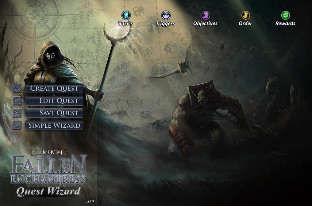
I feel Save makes most sense in the main menu, but I supposed it could (also?) be squeezed in after Rewards?
Try a completely black 30% transparent background for the Save page and let's see how that looks as well.
The nav font is Trajan, the version one is italic Times. Try different variants of Segoe, Myriad Pro(standard), or Verdana for links, buttons, and headlines.
Replace the Simple Wizard button with Exit for the time being?
Design active and/or hover states for links and buttons?
Other changes before slicing?
